Most people think calligraphy needs fancy gear or years of training. In fact, the biggest barrier is often the starter kit that promises perfection but delivers frustration. This guide shows you how to do basic calligraphy for beginners, from the right tools to daily habits that turn shaky lines into graceful letters.
By the end of this article you’ll have a clear workflow, a checklist of supplies, and a set of drills you can practice every day. Let’s get the ink flowing.
Step 1: Gather Essential Materials
Before you even pick up a pen, think about the surface your nib will meet. A smooth, heavyweight paper lets the nib glide without tearing. The research hook warns that the cheapest starter kits often lack this important match, forcing you to waste ink and patience.
Here’s a usable list of what you really need:
- A pointed nib such as a flexible, beginner‑friendly nib, praised for its smooth bite.
- A sturdy oblique holder that works for left‑ and right‑handed users.
- Ink that flows well straight from the bottle; a high‑flow sumi ink is a reliable choice.
- Paper that feels slick but absorbs just enough; a premium heavyweight paper (120 gsm) or a smooth dot pad.
- A ruler or rolling guide to draw baseline, x‑height and slant lines.
- A soft eraser for cleaning pencil guides.
Why each item matters becomes clear when you try the first stroke. A too‑sharp nib scratches the paper, while a nib with a factory coating will repel ink unless you clean it properly. The A.R.S. Method (Angle‑Rotation‑Slant) from a reputable online calligraphy resource reminds you to aim for a 45‑degree nib angle, keep the vent hole upright, and align the nib with your slant line.
Once you have these basics, you’re ready to move on to the building blocks of every letter.
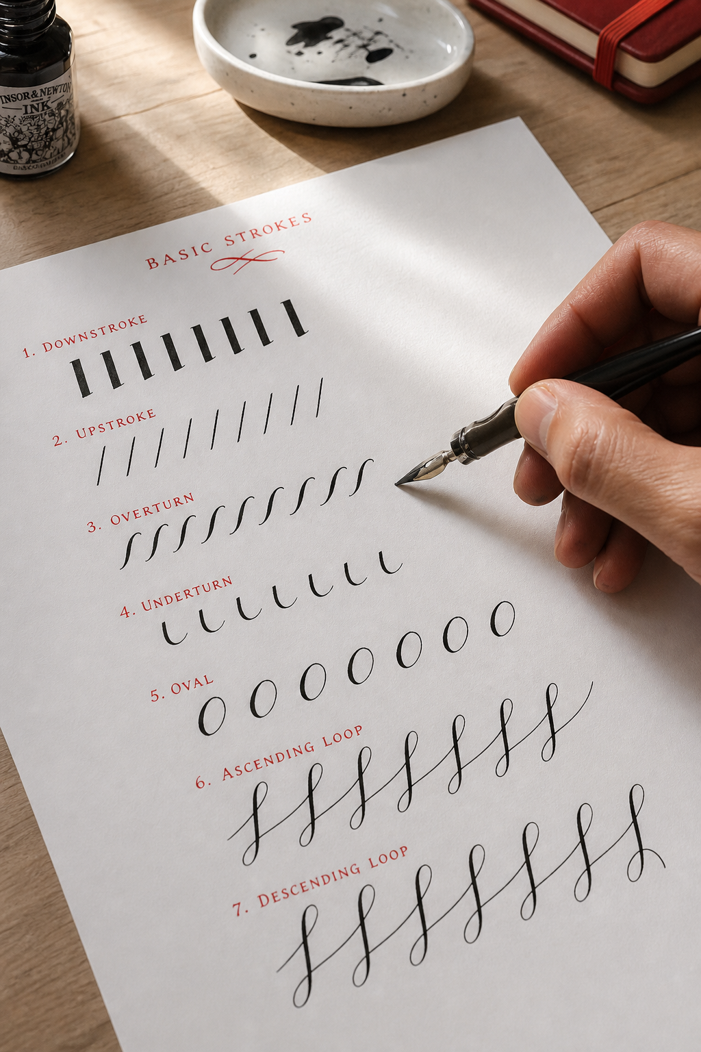
Step 2: Learn the Basic Strokes
The foundation of calligraphy rests on eight basic strokes. Learning them lets you assemble any alphabet without memorizing each letter individually. Light upstrokes and heavier downstrokes create the signature contrast that makes modern calligraphy look alive.
Start with a simple brush pen or a pointed nib. Hold the pen at a consistent 45‑degree angle, apply barely any pressure for upstrokes, then increase pressure as you move down. Practice the following strokes on a ruled sheet:
- Entry stroke , thin upstroke that curves from baseline to waistline.
- Exit stroke , the reverse of the entry, ending with a thin upstroke.
- Oval stroke , combines an upstroke, a loop, and a downstroke.
- Ascending loop , starts thin, thickens at the apex, then returns to thin.
- Descending loop , the mirror of the ascending loop.
When you feel comfortable, record a short video of yourself. Watching it in slow motion reveals hidden tension or uneven angles.
For a deeper look at why upstrokes stay thin and downstrokes get bold, see Wikipedia’s calligraphy overview. It explains the physics of pressure and ink flow, reinforcing the practice drills you just tried.
With these strokes under your belt, you can tackle the full alphabet.
Step 3: Practice the Alphabet Letters
Now that the strokes feel natural, string them together to form each letter. The alphabet can be broken into three groups: simple verticals, curves, and those with loops.
Print out a free practice sheet (many are available from art schools) and trace each letter slowly. Focus on one letter at a time: write it five times, then compare the rows. Notice where the downstrokes become too thick or where the slant drifts.
Imagine you are copying a favorite quote. Start with the lowercase letters, then move to the capitals. This step‑by‑step buildup mirrors the approach used by the Hand Lettering for Beginners guide on CreativiU, which emphasizes daily drills before tackling full words.
After you’ve filled a page, flip it over. The side with the faint pencil guidelines should show a clear, even rhythm. If any letters look cramped, adjust the spacing by adding an extra tiny gap between strokes.
With a solid alphabet you can start forming words.
Step 4: Master Consistent Angles and Spacing
Even the best letters look messy if the slant and spacing vary. This is where the A.R.S. Method shines. Remember:
- Angle: Hold the nib at about 45 degrees.
- Rotation: Keep the vent hole pointing straight up.
- Slant: Align the nib with the guide lines you drew on your paper.
Set up a ruled sheet with three parallel slant lines. Write the same word on each line, then compare. The version that matches the slant most closely feels the most polished.
Spacing, or kerning, is the gap between letters. A quick rule of thumb: the space should be roughly the width of the letter’s thin upstroke. If the gap looks larger, tighten it; if the letters crowd, add a tiny extra space.
Watch this short video that demonstrates the A.R.S. technique in action:
For a technical deep‑dive on nib geometry, see Wikipedia’s nib article. It explains how the oval hole and the metal coating affect ink flow, echoing the cleaning tip that you should wipe the factory coating before first use.
When you’re comfortable with angle and spacing, move on to building words.
CreativiU offers a series of practice videos that walk you through setting up guidelines and checking spacing, reinforcing the habits you just built.
Step 5: Form Simple Words and Phrases
Now that each letter stands on its own, combine them into short words. Choose a phrase you love , a quote, a song lyric, or a greeting card line. Write it in all lowercase first; this forces you to keep the slant uniform.
Start with the first word, using the same baseline for every line. When you finish, step back and look at the overall shape. Does the line rise and fall naturally? If not, adjust the slant or spacing of the problematic letters.
One common mistake is to lift the pen too early, creating gaps. The solution is simple: keep the nib in contact with the paper between letters, then lift just enough to move to the next starting point.
To test readability, take a photo of your work and view it on a phone screen. Small letters should still be legible at a glance. If any letter looks cramped, add a micro‑spacing tweak.
Here’s a quick workflow you can copy:
- Write the phrase in pencil using guide lines.
- Trace over each letter with your nib, respecting the A.R.S. angle.
- Review spacing; adjust by adding or removing a tiny gap.
- Finalize by going over the entire line once more for consistency.
For a visual example of this process, see the How to Choose the Best Calligraphy Online Class guide on CreativiU. It walks through a real‑world project from start to finish.
With confidence in simple words, you can start adding personality.
Step 6: Add Simple Flourishes
Flourishes turn plain text into artwork. Begin with tiny extensions on the ends of letters like “g”, “y”, and “f”. The key is to keep the extra strokes thin and elegant, never overpowering the base letter.
Try these three beginner‑friendly flourishes:
- Trailing hook, a light curve that follows the downstroke of a “g”.
- Swash, a quick, sweeping line that caps an “a” or “e”.
- Looped tail, a small loop added to the end of a “y”.
Practice each on a separate line before mixing them into full words. Notice how the pressure changes: a flourish starts with a light upstroke, then a gentle increase for the curve, and finally a release for the tail.
A helpful tip from a popular online calligraphy resource is to sketch the intended flourish with a pencil first. This gives you a roadmap and prevents over‑drawing.
When you feel ready, add a modest flourish to a short phrase , perhaps a decorative “!” at the end of a quote. Keep the overall composition balanced; too many swashes can make the piece look chaotic.
Once you’re happy with the look, you can protect your work for the long term.
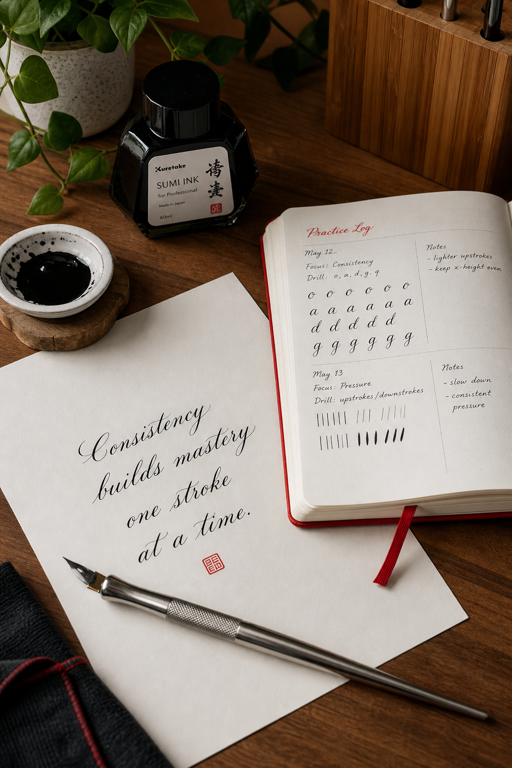
Step 7: Care for Your Tools and Keep Practicing
Even the finest nib will deteriorate if you neglect cleaning. After each session, rinse the nib in warm water with a tiny drop of dish soap. Gently wipe it on a paper towel until the coating looks even. This mirrors the cleaning ritual described by a popular calligraphy resource, where a quick spit‑and‑wipe removes factory oil.
Store your pen in a dry holder, not in a damp drawer. If you use a brush pen, cap it tightly to prevent the bristles from drying out.
Practice should become a habit, not a marathon. Aim for a 10‑minute daily drill: three upstrokes, three downstrokes, then a short word. Consistency beats length; a short, focused session each day builds muscle memory faster than a long, infrequent one.
When you hit a plateau, try a new worksheet or switch to a different nib size. Changing the nib forces your hand to adapt, which sharpens control.
For inspiration, browse the community forums on CreativiU where members share daily practice logs and tip sheets.
By caring for your tools and committing to regular drills, the progress you saw in the first week will compound into confident, fluid lettering over months.
FAQ
What kind of paper works best for beginners?
Choose a smooth, heavyweight surface that won’t bleed. High‑quality laser printer paper (120‑140 gsm) or a smooth dot pad provide the right balance of glide and durability. The smoothness lets the nib slide cleanly, while the weight prevents feathering of ink. If you prefer a textured feel, a slightly heavier Bristol board works, but you may need to adjust pressure.
How often should I clean my nib?
Wipe the nib after every session. A quick rinse in warm, soapy water removes ink residue and the factory coating that can block flow. Dry it on a paper towel and give it a light tap to ensure even coating. If you notice ink blobs or uneven lines, repeat the cleaning before you resume practice.
Can I use a regular ballpoint pen instead of a calligraphy pen?
Yes, you can practice faux‑calligraphy with a ballpoint pen. Write the letters with thin upstrokes, then go back and thicken the downstrokes using the side of the pen or a second pass. This method helps you internalize pressure differences before moving to a true nib or brush pen.
What is the best way to set my slant angle?
Draw three light guide lines at a 55‑degree angle across your page. Rotate the paper until the lines line up with the edge of your desk; this makes it easier to keep the nib parallel to the slant. Many beginners find using a protractor or a printable slant sheet helpful for the first few weeks.
How do I avoid ink blotting on the paper?
Blotting usually happens when the nib is dipped too deep or the ink is too thick. Aim to dip just past the oval hole, as research from industry experts suggests. Test the nib on a scrap piece; if the line looks too thick, lift the nib slightly and wipe excess ink before continuing.
How can I keep motivated to practice every day?
Set a tiny, reachable goal , for example, three minutes of basic strokes each morning. Record your progress with a photo or short video. Seeing improvement over a week provides a dopamine boost that turns practice into a habit rather than a chore. Pair the session with a cup of tea to make it a pleasant ritual.
Conclusion
Starting calligraphy doesn’t require a mountain of gear or years of experience. By gathering the right tools, learning the eight basic strokes, and applying the A.R.S. Method for angle, rotation, and slant, you lay a solid foundation. Practice the alphabet, build words, and sprinkle in modest flourishes to give your lettering personality. Finally, treat your nib with care and commit to short, daily drills , that’s the recipe for steady improvement.
CreativiU’s online library offers worksheets, video tutorials, and a supportive community that can keep you on track. Look at the resources, set a tiny daily goal, and watch your letters evolve from shaky sketches to elegant script. Happy lettering!
Leave a Reply